Blog
How Oversharing Creative Options Will Hurt Your Brand (On Hand of The Worst Magazine Cover Design of 2014)
When I was 8 years old I started ‘a publishing house’. I named it Buttersemmelweich Verlag. A real memorable name, right? It translates to ButterBreadSoft Publishing Co. It only published a single magazine, but over the course of several years. It was called SNOOPY. Go here for a stunning visual I dug out from the family archives just for you. Please note the Nike logos on Snoopy’s shoes, a sign of innocence lost and a hint of my future in branding. Perhaps the Charles M. Schulz Museum (which I can highly recommend a visit to) will sue me for the 6 issues I sold – yes, the young entrepreneur that I was I actually asked my family members to pay for my work. Just like a retainer, each issue I drew and wrote was copied 6 times (by my mum) and always sold out (to my mum Etc). As I grew a year older the name of the magazine was changed to JoeCool, an obvious transition, and I brought on ‘a partner’ as one ought to do, especially since I could not use the typewriter yet. My fascination with magazines grew over the years. As a young communication designer I felt the need to be on the forefront of pop culture, to be informed about as many topics as I possibly could in a swift and constant manner, while being surrounded by the freshest fonts and layouts. Since the internet has not quite been as giving back then as it is today, buying as many magazine subscriptions as possible was my goal. I have since adjusted my subscriptions, but have not kicked the habit. Needless to say, I have seen (and over the years also professionally designed) plenty of magazines.
As I descended into the current issue of Bloomberg Businessweek a couple of evenings ago, I was shocked before I could even flip to Page 2. The cover was bad. It was so bad that it was actually appalling to me. Judge for yourself:
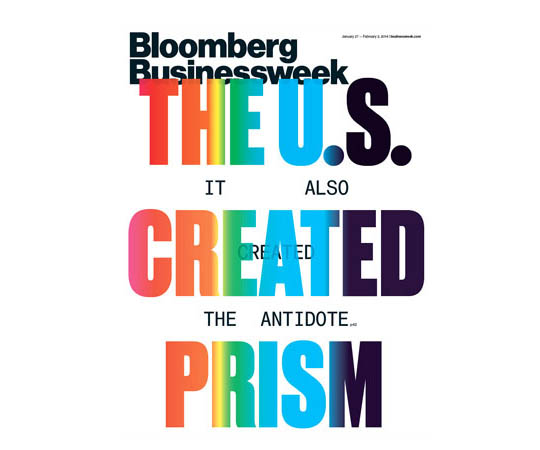 I was shocked, not a bit intrigued, only shocked, and a little sad as Bloomberg Businessweek has been pushing its design steadily after its acquisition in 2009. Conceptual, socially challenging and often shocking cover designs were part of their re-branding. But this cover is just shockingly bad.
How did it happen and why would you care?
Bloomberg Businessweek shares the story on how the covers were conceived in each issue, on Page 2, right next to the index, a prime location for any magazine. So here it goes:
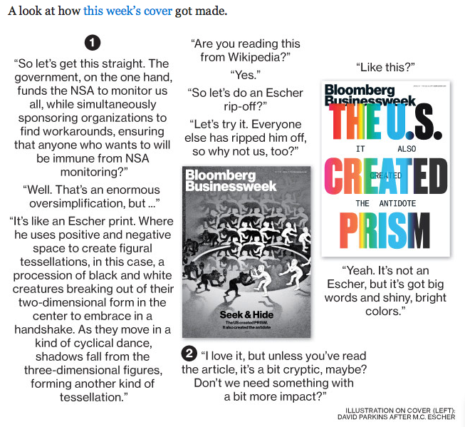
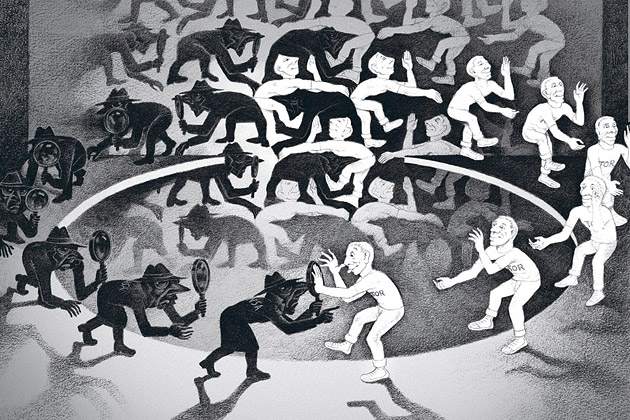
Image Source: Bloomberg Businessweek
Yes, indeed they talk about ripping off MC Escher – and may I add that the original design (above) also has a touch of Spy vs Spy ‘borrowing.’ Alright, I registered that as a bizarre strategy statement, but going from a solid conceptual and surely intriguing (yet copied) design to a horrendous – ‘at least it’s got big colorful letters’ – solution makes it obvious that the chosen design option only made it to the cover in a rush to meet print-deadlines (imagine how long the Escher illustration must have taken to create?).
As the reader, a consumer, the target audience, do you see the problem? Sharing both designs and the decision criteria is a very bad brand decision. If the cover design is genius, Bloomberg Businessweek’s story on how it was made is only killing the magic. No room left for imagination. Even worse, we can see how bad the other cover design option was, making the amazing design option that much less great as we want to feel designs go from good to better to great. If the design is really bad (as it is in the current issue) and the option that did not make it would have been significantly better (as was the case in the current issue), the reader is upset and disappointed by Bloomberg Businessweek’s choice. This is obviously not good for a brand and I see this as an open letter to Bloomberg Businessweek to change its strategy and to use this Page 2 real estate for something that works for, instead of against, its brand.
As an entrepreneur, never share your design options with your audience at large. It’s tempting as they are the ones that will need to buy (into) it. If you really don’t trust your brand or design consultants, have a small and narrow focus group, if you must, but do not share design options with your entire audience. Not during, and definitely not once they have been made. Most everyone who did not go through design college tends to screw this up big time. Look at Marissa Mayer’s big fail when introducing the public to Yahoo!’s logo re-design last year. Everyone got excited, everyone had their favorites, and then…a universally disappointing final choice.
The habit of sharing creative options is one of over sharing, or TMI as one would text. Don’t fall into this invitingly open trap as your audience’s TMI feeling would very quickly morph into an OMG and a WTF (Excuse my language) expression on your end. Spare yourself, and your brand that pain.
The Leaf Blower Syndrome
I am not sure about you, but I can not stand leaf blowers. The concept does not work for me in any way.
Now if you live outside the US, or in a region that has sane laws restricting or prohibiting the use of such evil devices, you may not know what I am referring to. The concept is simple: Leaf blowers use high pressure air, like a fan or hairdryer on steroids, to move leaves from one area to another, most often this means your gardeners blow them to your neighbors, or onto the street. Problem solved? Not quite. Either your neighbor hates you now (even a bit more), or the wind blows them back to you, eventually. Solution? Have the leaf blowers come by more often.
Now that I filled you in, let’s do this again:
The Leaf Blower Syndrome: Brand Identity of Startups
Leaf blowers postpone an issue, while displeasing everyone who gets in touch with them. It stinks up the neighborhood, is annoyingly noisy and pushes a problem from one place to another. Bingo! Out of sight – out of mind. Now that was quick and cheap. Consider those massive amounts of leaves handled.
On my way to our office last week, my thoughts deeply entrenched in the world of branding (as you’d expect), leaf blowers pushed their leaves smack onto a busy street during rush hour traffic. As I passed them I saw those leaves go absolutely everywhere; mostly right back to where they came from. It made me think of all these startups saving money bootstrapping (Hint: ’99 Designs Dot Com’) – now read these two words carefully – their identity by crowd sourcing it to strangers to create cool designs. They will not arrive at a solution easily, so they get more leaf blowers to work faster and more often creating vast amounts of different logo designs, spending hours over hours discussing the designs they receive in their Inbox until they need to just pick the one they ‘like’ best.
A couple months later early brand adopters gather and success hits. The wind has changed, the leaves are coming back. This is the point in which they realize that the logo is not their real identity. It does not connect. It is missing meaning. It does not have nor create a story. They need to re-brand, even though they just spent all that time and energy, and by now even a sizable expense. And this time it is going to be much more costly then had they done it right from the get-go. They have to re-educate their customers, hire a specialist whom they pay professional fees like they do with their other consultants. They need to re-create all touch points from the web site via all the collateral to perhaps even the signage. It stinks.
If you ask successful startups what they would have done differently in retrospect, many say they wish they had not cut costs on their initial branding or web site efforts. The wind changes, the leaves come back, but at that point the neighbors already like you that much less and making up is hard to do, a much lengthier process that involves other ‘leaf-behinds’ (sorry, I just had to!).
I recall my parents picking up leaves in batches in our garden and carrying them to the compost to get rid of them. Now that makes a whole lot of sense. It definitely was a time investment, but only a one-time investment. It even had a romantic part to it. It showed they cared and that the seasons were changing.
Pick up the pieces, make sense of them, do it with love, and it will show. Just remember, it’s your startups identity.
CATEGORIES: Startup Advice Your Brand Launch: Identity
How to Leverage the 3 Core Components of Your Brand Identity to Enhance Messaging
When we think of brand we first think of logo (even though we know a brand is much more than its logo). The logo is the key point of visual interaction with a brand, hence we are likely to recall it every time we think (or talk) of – or write about – a brand.
During the brand identity (‘logo‘) design process entrepreneurs often forget that there are 2 other elements that help tell the company or product’s story. They interact and bring value to the brand identity as a whole. Do not repeat the same message, but instead ensure to leverage these 3 core components to create a stronger, deeper brand message:
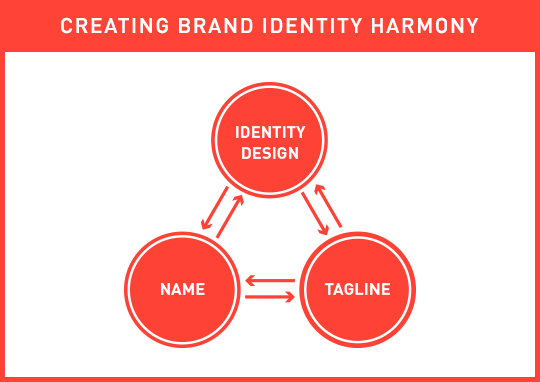
The 3 core brand identity components need to complement each other, each adding something unique to the whole story, and together forming a cohesive and strong initial brand message.
If your name describes your business, do not focus on showing the same message in your logo; instead use your logo to talk about other key elements that describe and differentiate your business. If you are in the cloud storage business and your name includes the two words cloud and storage (A bad company name, yet good example: Cloud Storage Ninjas), have your logo visualize security and stability, if those are key components of your brand’s message. Contrary, if your name is nondescript, either fabricated or an acronym, ensure that the associated brand identity design visualizes what you are in business for (EG: “Cloud Storage“).
Often forgotten during the brand identity design process (and beyond) is…the tagline. There are many factors to blame for the slowly occurring extinction of the tagline (mainly of digital nature, as tag lines are hard to squeeze into apps and templated web sites), but the power of a great tagline is still immense (Just do it, I say!). The tagline should be alive and kicking even though its placement has changed (from the traditional place below the brand identity design). It can now be used as the first header users see on a brand’s web site, the descriptor below the company name in an email signature, in place of yet another step-and-repeat icon pattern on a back of a business card, or in the often underestimated – yet early – brand touch point, the lobby of a business. The tag line is a powerful tool, that, together with the name and brand identity design, tells a stronger, deeper and more actionable initial brand story. It is a leading actor and you can write the script.
Keep the bigger picture in mind when embarking on your identity design project and use your Brand Platform to ensure these 3 core elements touch on more than just one or two of your core values and differentiators (while keeping it visually simple).
Next week I will talk about why our identity design looks the way it does. Are we not following our own rules, are we lazy, or is there a different strategy at play? Hint: It’s the latter.
Personal Notes of Inspiration For 2014
What drives you as an entrepreneur? A question all of us get asked a lot, and one that we ponder especially during these last days of the year where we look back and analyze. We try to learn from our mistakes and make sure to celebrate our achievements, all whilst looking ahead into a new year with the plan to accelerate and prosper, our companies as well as ourselves personally.
This inspiration to keep pushing, to uncover solutions, to assist others and to turn into better human beings, or brands, comes from strange places: nature, arts, (mostly silent) sports, science and fellow human beings. Each and every one of us picks their favorite source of inspiration, and over time, after our 20th marathon or 10th Art Biennial visit, we realize that it is what informs our work. In a subliminal manner, but one that once realized can be analyzed and traced right back to those often addictive and slightly obsessive personal journeys deep into a matter that is far removed from our professional area of expertise and work place.
Today I share mine with you, knowing all too well that personal obsessions are ill-advised to be shared with large audiences, as they are odd and, well… personal, but by me doing so, I hope to inspire you to stick to that thing you do that takes a lot of your time away from your work, your family and friends, yet you need in order to keep being inspired, and to keep inspiring others.
2013 ReVisited is this obsession, my labor of love; a carefully curated selection from 5,315 musical tracks released in 2013 that found their way into my collection, which means I listened to an album and a half every day of this year. I then compiled the best tracks into a monthly curated podcast called PreVisited. This compilation showcases the best of those podcasts. It represents my personal journey through the music that was released this year and it might even turn into your soundtrack of 2014. You will rediscover electronic music pioneers (OMD, Depeche Mode) and all-time greats (David Bowie, U2), while getting to know artists you may have never heard of (Mt. Royal, Charley Bickers, Jont). You will find songs that belong to each other, creating perfect sequences in voice (Lorde & Emiliana Torrini) or music (Phosphorescent & Mt. Royal) and if you stick around long enough you get to explore German rap poetry (Thomas D, Xavier Naidoo). I hope you will find some new favorites, or at least enjoy this eclectic journey through the past year in music, while thinking about what it is that gets – and will keep getting – you inspired.
Thank you for following the New Brand Post, for stimulating my thoughts on branding and for absorbing them on a weekly basis.
Let‘s rock 2014!
2013 ReVisited (The best of a year in music) by Fabian Geyrhalter on Mixcloud
CATEGORIES: Blog Startup Advice
Launching Brands Online in 2013: One Step Forward, Two Steps Back
I am sick. And it’s not the flu.
I am sick to my stomach looking at all those amazing new ideas from sharp entrepreneurs going up online. Ideas that are as varied as they could possibly be, all nurtured by a revolution in online fundraising and fueled by an economy that is looking for the next big thing. Many of those ideas I see are truly revolutionary, but it still makes me sick looking at them. They all seem identical and I can not differentiate one site experience from another.
The internet gave entrepreneurs the ability to use cheap, often free, templates and it happens that everybody chose the same ones. I can’t blame them, these are robust templates taking advantage of responsive web design, while being equipped with all the features necessary for most entrepreneurs this day and age. They look and feel modern and they represent what I’d call a MVW – A Minimum Viable Website.
One thing gets lost though, sometimes is even missing from the get-go: A big brand entrance through a unique visual language that differentiates the brand enough to stay in the audience’s minds.
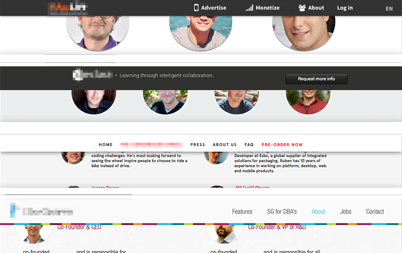
Above: Four startup sites I came across recently. Who is who? Which product is which? Wait, was that the site of that company I liked so much?
Conceptual and visual creativity used to be the integral ingredient of any brand introduction in the heyday of printed communications – they now are missing in action. To many of today’s entrepreneurs it is the product/service idea alone that counts, but sadly that idea gets lost without being embedded into a branded environment. The internet provides free tools; it does not mean that those fit into your company’s launch strategy. Leverage them when appropriate, avoid them when launching a brand. Consumers will get lost and your unique idea will look like a standard idea by using standard templates.
Be bold, be different, be conceptual. Go ahead and inject your enormous amount of creativity, strategy and moxie into your online presence, because it will be the place most people will meet your product/service first. And as far as I can tell it’s anything but standard.
CATEGORIES: Blog Your Brand Launch: Digital
Building Your Brand From The Ground Up (A Fireside Chat With Yours Truly)
A couple of weeks ago, Bob Garlick, host of Business Book Talk (poking through below), contacted me to schedule an interview about our book ‘How to Launch a Brand.’ With Bob sitting in Vancouver and myself in Los Angeles, I was immediately taken by surprise as there was no script that he shared with me, no canned answers to prep, no warmup chatter and no edits were made to our conversation.

The result is an honest and stimulating conversation between two individuals with a keen interest in design, branding and entrepreneurship, which I’d like to share with you. Below audio not only gives you a peek into our book, but also covers topics such as misconceptions of branding, brand strategy, how brands need to be different than 15 years ago and how to connect with your customers through branding:
Audio clip: Adobe Flash Player (version 9 or above) is required to play this audio clip. Download the latest version here. You also need to have JavaScript enabled in your browser.
(Can’t see above audio player in your E-Mail? Please listen to the audio via our site)
Now that I crossed the bridge by posting audio (how adventurous), I might as well share a quick video in which I further define ‘brand’ specifically for startups, filmed at a mentoring session (how advantageous) at the Founder Institute in San Diego two weeks ago.
‘Tis The Season of Giving Thanks: Employee Holiday Incentives VS Restrictive Startup Cash Flow
I spend my days talking about early stage branding with startups and I learn a lot about their behaviors, struggles, fears, and of course their amazing energy and innovative mindset that I thrive off. At times I will use the New Brand Post platform to discuss startup culture and give entrepreneurial advice. It will save you from getting brandexia (a sudden sensation of anxiety caused by the over consumption of the word ‘brand’ by entrepreneurs, often leading to serious cases of brand self-awareness), while still gaining actionable insights and advice for your early stage startup.
As the holidays are approaching (Happy Thanksgiving to my US-based readers), so are company parties, chatter about Q1 goals, and speculations about holiday bonuses. Let me start off by saying that cash-based holiday bonus incentives are a wonderful thing, no doubt about it. I always love giving as well as receiving them thoroughly. Employees appreciate the gesture of appreciation and the fact that they may be able to plan a trip or buy some gifts they otherwise might not have had the opportunity to afford easily. But people investing their time and talent into a new venture understand that cash flow is one of the keys to the survival of the venture, that cash needs to be put to work in small chunks and in strategically calculated places that will directly impact the company’s growth (and yes, brand). Most early stage startup employees are very aware that they made a commitment to give up some traditional monetary perks for being part of the startup tribe, for investing into their future.
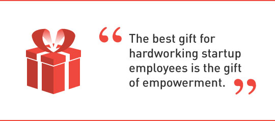
As a founder of a new cash-strapped venture, the most cost-effective and best gift for hardworking employees is the gift of empowerment. Create public awareness of staff by talking about their valuable insights and specific contributions they made to the company, publicly via a blog post or newsletter with the title ‘The Season Of Giving Back To Those Who Gave (Your Company Name) Their Best in 2013‘. Mention each and every one of them with specific insights they provided, or actions they took that moved your company forward, full names and photos included. If you have more than 8 employees, spread it out through the month of December. Share it via Social Media and tag them so the article shows up in their networks signifying that this is not out of self-interest, but pure thanksgiving.
Instead of giving a low (= insulting) cash bonus, or a gift that may or may not resonate with your staff, try honest public praise and let me know how it is being perceived. I bet they will thank you, sincerely.
CATEGORIES: Blog Startup Advice
Damage Control For The Misused And Abused Word ‘Brand’
“The word ‘brand’ needs a re-branding – due to its brand longevity the brand legacy is not brand-correct anymore,” I heard myself say unexpectedly in an interview earlier this week. It has been on my mind for a while. To no surprise, running a brand consultancy I am using the word a hundred times a day. Furthermore I just published a book titled ‘How to Launch a Brand’. The word gets tiring, especially since it leaves a bad aftertaste and I feel the need to first convince people that it is not a bad term before I start talking about it any further. Brand is not a four letter word.
Despite the negative connotations with the term, branding is more important today than it has ever been before and it is not only consumed, but furthermore created and curated by the masses through their very own personal (public/social media) brand. Brand is alive and kicking and we will not be able to change the term, but one can change the perception away from luxury good logos (Gucci, Chanel) and larger-than-life corporations seen as evil-doers (Exxon, Walmart) to a modern necessity, which, if created and nurtured in an honest and authentic way, turns ‘brand’ into a holistic ‘aura’ of a product/service provider (or person) that we are allowed to have admiration for (From an iPhone to a Celebrity), aspiration towards (From a Nonprofit to a highly ranked University) and sometimes draw inspiration from (From Ted Talk to Oprah).
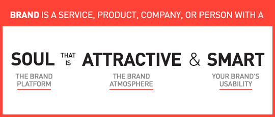
To me, a brand is a service, product, company, or person with soul, that is attractive and smart.
1. Soul is the beating heart, the reason a company should exist and why your initial attraction matures into love. You put your trust in brands with a soul and most often your money follows soon thereafter. Not much different than with human relationships, soul is the reason why we care for each other, or a particular brand.
2. Attractive is the brand aura that allows for the gut instinct emotional connection you feel when getting in contact with the brand. It is the design and the voice that is carefully created and curated over time in a particularly consistent manner. Attraction is not to be mistaken by shallow beauty.
3. Smart is its usability. How easy is it to engage with the company/product/service/person? In the tech industry it is User Interface and User Experience, with consumer products it is the product and packaging design and with services it is often the design of key offerings combined with its delivery.
Now that we ‘talked’ about the complex strategy that creates the beautiful simplicity that makes a brand, maybe we should give the word another chance?
Car Naming VS Auto Naming: Are Real Names Superior to Alphanumeric Names?
Car names run the gamut from great names that evoke strong imagery and emotion like “Mustang” via alphanumeric naming systems to underwhelming names like “Golf” that fall flat and fail to impart a personality. What is behind these sometimes great, but more often bizarre naming strategies of these car companies? Inspired by a late night conversation I had with the CMO of a large European car brand the other day, the question lingered and I had to dig deeper:
A broad overview of naming strategies in the automotive industry reveals that mid-price companies like Volkswagen, Toyota, and the European car company Skoda opt for either using real words as names — a lá Toyota “Land Cruiser” — or made up names like Volkswagen “Jetta”. Higher-end brands like BMW and Lexus tend to use an alphanumeric naming strategy. By using real names, the consumer connects with the model of the car: A driver of a Ford Mustang is more likely to say “I drive a Mustang” as opposed to “I drive a Ford”. Alphanumeric names tend to place the emphasis on the make of the car, the brand, over the model: A driver of a Lexus is much more likely to report “I drive a Lexus” than to say “I drive an ES”. That is the power of Alphanumeric names, yet its downfall is that they offer little emotional connection to the actual car model and most often lead to frustrating confusion during the shopping process.
As you climb to the top of the pricing scale, with ultra luxury vehicles such as Bentley and Rolls Royce, the strategy of using real names and/or fabricated words for vehicles comes back into play. Words such as Phantom, Ghost, and Wraith depict the current line of Rolls Royce vehicles conveying a sense of mystery and intrigue.
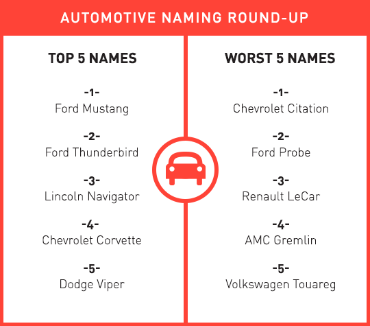
Here is our round-up of the top 5 best car names and the top 5 flat tired names. We focused on ‘real’ names and not ‘auto’ names (as I may call them, pun and all) as the 750 Li Sedan (BMW) VS the IS 350 F Sport (Lexus) might have bored you.
What do you think? Did we miss any?
CATEGORIES: Blog Your Brand Launch: Naming
The Importance of Branding At Time of Launch For Tech Startup, B2C/Retail And B2B Company Founders
‘Is branding the key for a successful start-up?‘ is the topic for a speech I was asked to give at Internet Hungary this week. I could make it a 5 second speech and say ‘Yes, it is one of the most important factors,’ but lucky for me the topic is broader and will go deeper into the keys of creating a successful brand. Let me use this opportunity though to dive knee deep into this question as some brand elements are more important to certain types of companies at time of launch than to others:
No one shall skip the Brand Platform creation at the onset of a new venture, unless you want to compete on price, be boring and unattractive to work for, and are not keen on acquiring the right target audience at time of launch. You tackle the Brand Platform right after you draft your business plan (from fully fleshed out to napkin version – all are acceptable forms of business plans at this stage, depending on your own comfort level).
Launching with a meaningful and unique Name and Brand Identity Design seems like a no-brainer, a must for all entrepreneurs. If for whatever logical reason (budget not being part of that logic) you feel forced to launch with a sub-par name and logo, knowing you will have to go through a (more costly) re-naming and re-branding exercise upon showing first successes, it is the easiest to do for a tech startup or B2B venture that requires solely test users or relies on a very small niche audience, which will make it easier to educate them on this big and disruptive brand change down the road. Some Tech Startups (especially apps) are prototyping until the day of launch, making it an easy excuse to skip this essential step, whereas it is much more advisable to work on a prototype whilst formulating the brand platform, that way you are educating yourself about the target audience while you see them use the actual product, enabling you to create a meaningful brand that will not have to be rebuild soon thereafter. A win – win.
Needs for Brand Atmosphere Touch Points vary in importance and specifics from company to company with retail and other mainly offline B2C companies leading the list, E-Commerce and Tech Startups surviving off some basic, consistent touch points bundled with heavy E-Marketing template creations, while most B2B brands fall anywhere in-between, depending on their structure and audience. If bootstrap is your motto, these can be rolled out over time, making it essentially more pricey, but allowing you to spread the cost.
It only makes sense that ventures leading with digital need to make UI/UX Design part of their strategic brand implementation. Most companies – B2C/Retail and B2B – rely heavily on brand-centric (responsive) web sites to attract and convert leads of different types. For Online Retailers and Tech Startups where the web site also is the product, the prototyping should be addressed in parallel with the Brand Platform creation as it will educate the branding process as a whole. Some companies are able to save on development costs using existing WordPress templates (and such), but brand will still be key at launch.
To conclude, whenever a startup founder tells me (and they tell me all the time) “I can not afford branding at this early stage of my company formation” I reply with “No, you cannot afford not to brand at this early stage of your company formation. Unless you think a strong brand is worth less at time of sale or IPO than an ugly yet functional prototype.‘ This often marks the end of our conversation, until they call a few weeks later to get started with branding their new venture.

The Post Host
Fabian Geyrhalter is Principal of FINIEN, a consultancy specialized in launching brands for entrepreneurs.
JUST RELEASED
How to turn any venture into an admired brand
THE #1 BESTSELLER
How to Launch a Brand