Martian Brand Strategy
Martian approached us with an inspired winery name, derived from the owners' sons (Martin and Ian), and backed by an exceptional vineyard location and talented winemaker. What was missing was the brand strategy, identity and design. We set out to create the brand as it launched into the saturated California wine market in midst of an economic downturn. Offsetting the obvious (characters of Martians) with brand surprises and drafting stories of authenticity and quality as part of the brand launch were key findings of our strategy phase. We advised to use a rather generic Martian as a surprise that needed to be sought out by the ones interacting with the brand. The character hunt became part of the brand story in true alien-fashion: When visitors roamed around the tasting room property they were greeted by them in random areas of the vast property, the Martian was etched into the bottom of the tasting glass, visible only upon final sip. The tribe loved the Martian hunt, while the hidden character ensured to not dilute this brand of fine wine.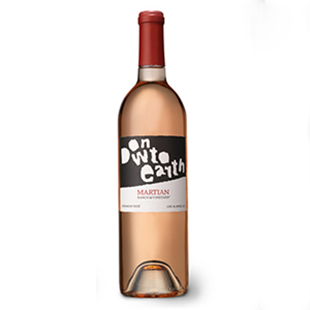
Martian Naming
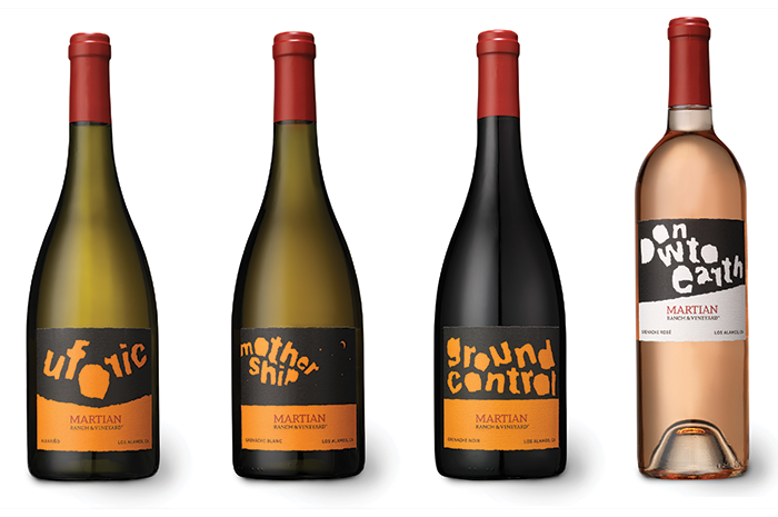
As part of a special label series for this California winery, we put our heads together with the proprietor and together derived names ranging from Down to Earth, Mothership, Ground Control (hello, Major Tom?) to Uforic to tie in the otherworldly quality of the wines (and, yes, the name) with the qualities of the grapes.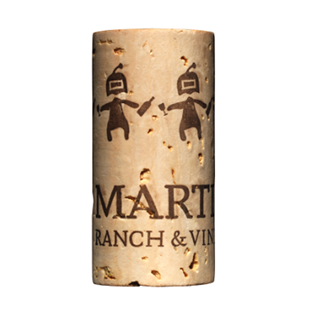
Martian Identity
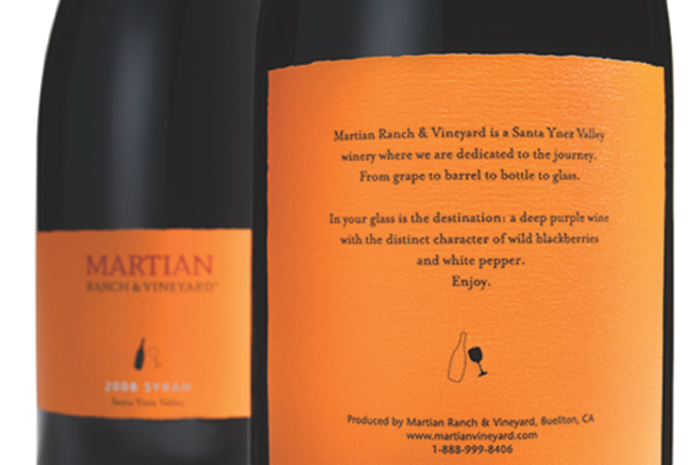
The typography-based Martian Ranch & Vineyard brand identity used an existing serif typeface that was redrawn by hand to lend an authentic, organic, and otherworldly feel to it. The deep red wine tone seemed especially fitting as the name itself recalls the red planet. The Martian character appeared nowhere on the label, only on the cork once the bottle was opened (Martians playfully handing each other refills).FINIEN's creativity and attention to detail are invaluable to the success of our winery. From brand identity through design their service is unparalleled.
- Michael Roth
Winemaker

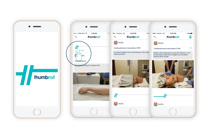
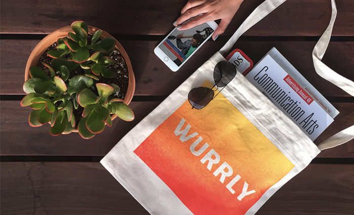
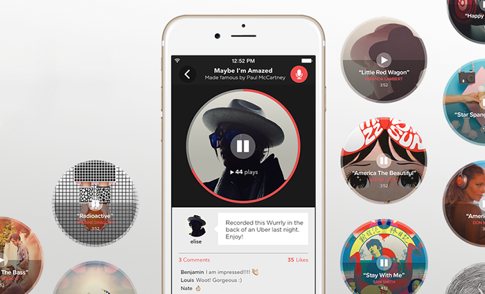
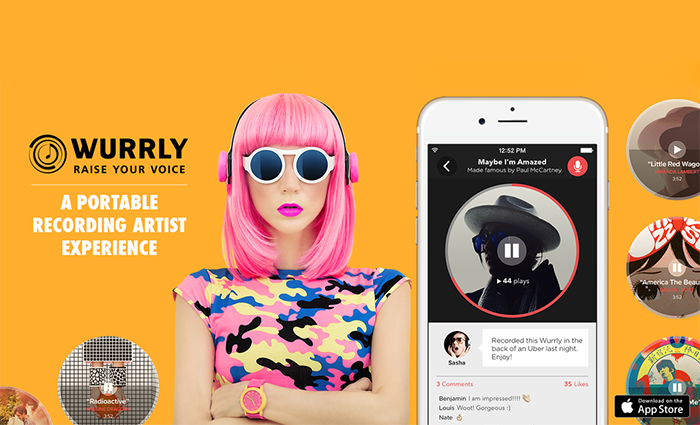
Wurrly Brand Strategy
Los Angeles based startup Wurrly is a free mobile app that transforms your smartphone into an on-the-go music studio with a fully customizable recording artist experience. We worked with Wurrly through our one-day brand strategy workshop to derive the brand's personality, values, and better define the story. As sometimes is the case in these magical days, we also derived the tagline that day: RAISE YOUR VOICE; a line that speaks to the empowering opportunity for artistry and social sharing that Wurrly promotes.Wurrly Identity
A dynamic brand identity for this rapidly growing startup that mixes music and tech to bring the ultimate karaoke experience to the app store. Based on the findings of our Resonaid™ brand workshop, we crafted a mark that touches on the universal nature of music and the concept of the 'whirl' as it evokes its musical feel. The brand radiates the idea of 'connecting people through song' - and the icon needed to ensure it does that in a manner that is easily understood by the target, while making it scalable for its key usage in an app and social media environment. The brand icon set the stage nicely for a startup that is seeing tremendous adaption by its tribe.Fabian is extremely detail oriented and personable, he ran us through a branding workshop thereafter designed the logo. He and his team are easy to work - they listen and then think outside the box in a creative collaborative way. I found the entire process highly rewarding and would recommend them to anyone.
- Nadine Levitt
Founder & CEO
Opal Identity
FINIEN re-launched Opal’s brand through all Brand Atmosphere touchpoints, creating a brand image that allowed the firm to compete on the national level of real estate investment and management. The brand identity design was the key asset, showing monumental strength and alluding to a three-dimensional element of impact and openness. The trustworthy typography and color mixed with the overall modern feel for this identity (created in 2007) ensured to stand the test of time.
NGF Identity
The identity re-design for the Nikolaus Geyrhalter Filmproduktion, a Vienna based production studio focusing on documentaries, was a family affair (Nikolaus is the brother of FINIEN's principal). The identity design represents the studio's critically acclaimed cinematic style and focus. Fans of his films quickly turned into fans of this icon as it translated the emotions otherwise captured by his moving images.
LazyHooks Identity
We created the identity design for music production label Lazyhooks. You may know the guys behind this label better as Capital Cities, the band that broke our hearts and chart records with 'Safe And Sound.' The logo's simplicity strikes a chord through the apparent hook and its playful nature. A safe and sound logo, in other words. And just like with all big hits, it ensures to remain timeless.
Onramp Identity
The hexagon and cube shapes in the icon represent Onramp’s expertise and thought leadership across its holistic 'six-levels-of-insight' approach to big data solutions, while also having subtle references to organic molecular structures. These six levels were uncovered and developed during a one-day FINIEN brand foundation workshop. The open spaces in the top right corner of the icon speak to the bridge or “onramp” that is being created to clear a path from latent data to fully visible and interpreted bioinformatic data. As a startup in the biotech space, this robust identity equipped the company to enter the world of big data like a big player in the field.
The Mainstream Identity
The Mainstream is a Los Angeles-based startup that serves as a commercial content platform providing users on-demand control over how they discover opportunities. The iconic identity serves the purpose of telling the story between user and advertiser through the shadow-play while creating the symbol of infinity for the endless stream of opportunities and possibilities within the platform. The upfront letter M ensures brand name recognition while allowing for scalability across the social media landscape. Not a bad mixture of ingredients for a startup that demands an iconic and meaningful brand identity.It's a pleasure to endorse Fabian and the entire team at FINIEN. With the almost impossible task of creating an easy-to-remember, global brand name, and URL, in a short period of time, FINIEN delivered not just one, but 4 great names – in their first attempt! In addition, we were very happy with the visual representation of our chosen brand name. Fabian Geyrhalter makes the process fun, easy, and they deliver on time. We look forward to working with them again!
- Rocky Hansler
Founder & CEO
Mindshare Identity
Mindshare LA is "a mecca for intellectuals, artists, scientists and other forward-thinking characters looking for inspiration and connection." We felt right at home crafting an identity for this inspirational event platform. The bold mark represents the space where opinions are being formed, transformed, and likeminded individuals meet through shared thoughts. The typewriter font used in 'Los Angeles' is a nod towards the creator community it serves. Given the nature of the brand, the icon was created to adapt to on-screen, projections, and name tags alike; and it has stood the test of time for nearly a decade.The term ‘branding’ is overused in business today, with little discipline paid to either the concept nor execution of crafting impressions worth our attention. Fabian’s work is the opposite and makes business sense while upholding time-honored European design traditions of legibility, maturity, and precision. Organizations receive the level of design they deserve. Does your vision deserve Fabian’s quality?
- Adam Mefford
Co-Founder
Don Joaquin Identity
Anticipating the arrival of its guacamole import into the US, the brand for Don Joaquin was inspired by the Aztec tradition and infused with modern ingredients to make it pop off the shelves. Authenticity was top of the list as we derived this iconic brand identity that blends tradition with a swirl of guac in the center of its medaillon-esque logomark. Soon after its introduction to the U.S. it found its way to millions of consumers through the aisles of Costco.
Co-opportunity Natural Foods Identity
Co-opportunity has been ahead of its time by providing natural, organic, and local foods to the Santa Monica area since 1974 (and it's a co-op - take that, millennials!). With the explosion of natural food markets around the area, it was time to make a change in brand image. We were tasked to create a unique identity that spoke to the brand’s values of better food and stronger communities. Given the nature of a co-op, we were faced by thousands of decision makers alongside the design process, so we had to ensure a home run with the community. The artistically crafted logo shows that there would be no co-op without the natural products and the people that farm and purchase it; the co-op would not exist - the word is white-on-white without the surrounding products. A home run it was, and the rollout across the store's brand atmosphere touchpoints clearly showed the adaptability and scalability of the newly crafted brand identity.
Grossman Design & Construction Identity
This identity re-design for Grossman Design and Construction was initiated to reflect the growth of the company. The use of its initials to create a modern three-dimensional structure was our solution to show craftsmanship and a focus on modern design while projecting the scale of projects that GDC was setting out to undertake.
Big Boom Media Identity
This identity was created for the brand launch of Big Boom Media, a startup specializing in SMS messaging advertisement. The brand image was created to show the explosive viral nature of Big Booms' work through a sleek, engaging, and ever-expanding identity design that was carried through various brand atmosphere touchpoints. Since launch, Big Boom Media has developed a reach of over 4 billion wireless subscribers, translating the identity's visual claims into tangible reality.
Bandito Brothers Identity
When we were approached by motocross legend Mike “Mouse” McCoy with a bold vision of creating a new kind of action-focused content creation and production studio, we knew that the brand identity would have to be something extraordinary. The sunrise, the banditos, the coyote, and the bike together turned into a legendary visual in and around Hollywood as the studio took off creating blockbuster box office films and commercials for Fortune 500s. While the visual and verbal language could have easily turned gimmicky and unauthentic, it was important to never slide down that path: Exceptional dedication to the brand atmosphere touchpoint designs through gold foil and other superior paper and fabric choices along the way ensured that the icon and its just as iconic typography became a symbol for out-of-the-box creativity and badass stunt performances.
Survios Identity
Brand Identity Design in partnership with the team at Survios, a revolutionary tech company focusing on virtual reality gaming and immersive entertainment research and development. The symbolism will remain a mystery due to the confidential nature of this fast growing VR company, but give it a second and you might realize a few strategies that have been derived to equip this bold startup with the lasting icon it demanded.
Audiolife Identity
Our brand launch for direct artist-to-fan music fulfillment service Audiolife created visually powerful, dynamic, and intuitive results for its 300,000 users, ultimately leading to the acquisition by the top ranked distributor. ‘The power of music’ was given back to artists and fans alike and was successfully communicated through an iconic brand identity. When there is one key message of empathy, don't hide it. Shout it through the identity, and the tribe will proudly support, wear, and tattoo it. Yes, this was that kind of iconic logomark.
California Community Foundation Identity
The California Community Foundation, a 100-year-old organization, holds nearly $1.5 billion in assets making it one of the largest community foundations in the nation. We were hired to undertake a large-scale re-branding effort to re-envision the brand identity and align it for the next decade to come. Signifying growth, stability, and origin (California) was the center-piece of the brand identity design and its iconic mark. Growth was shown through the green pillar that angles upwards, while sunbeams - or a wave - creatively nod at the origin of the foundation. 5 lines signified the 5 core values. Nearly a decade later, CCF still uses the icon we crafted as a visual translation of their wonderful and inspired organization.
Park Tahoe Inn Identity
Tasked to create a brand identity for a remodeled hotel in beautiful Lake Tahoe, we knew we had to find a way to showcase the majestic area in the most simplistic and modern manner, while standing out from the sea of hospitality logos in vicinity. Within the simple typographic identity, we focused on the elements of the lake as well as the mountains: the key attractions that draw visitors to this majestic area on the Nevada-California border year-round. The brand image was carried through all brand atmosphere touchpoints and continues to inspire guests to indulge in the surroundings of its beautiful location.
YelloUmbrello Identity
Crafting the brand identity for this new high-end chain of pet groomers, we knew we needed to shake things up with a dash of unexpected color and a playful, memorable and unique name. And of course it had to be damn cute, without that grooming kitsch with which we are all too familiar. While cats and dogs found a safe place under the yellow umbrella (yes, it's how we tricked them into getting a good wash), the brand atmosphere touchpoints found its differentiation through strong color and icon-language.
Yelloumbrello Naming
The name for this high-end pet groomer was derived from the notion of pets getting a good wash, which many canines don't list as their top ten things to do. The fun name YelloUmbrello defined how different the groomer was, while it also alluded to the franchising model (a brand umbrella). Most importantly though it created a sense of trust, ensuring pets were in a safe and clean environment. We also joyfully crafted the tongue-in-cheek tagline ‘Happiness is a pampered pet.'
Match Creative Talent Identity
Creative talent agency Match chose us to spearhead an all-encompassing re-branding effort of the firm’s dated identity system. Our solution revolved around the symbiotic relationship of talent and hiring party, the foundation of the company. Each letter consists of two parts that make it work, that hold it together, that create the company. It talks about co-dependency as much as leaning on each other to successfully fulfill a task. The symbolic letter A turned into the scalable icon while alluding to the transformation into a digital-first workflow (the hint of a cursor) that Match embarked on at the time of the re-branding. Match Creative Talent got acquired by Onward Search a few years after the re-branding initiative.Fabian and his group did an outstanding job on re-branding my company. I would recommend FINIEN as a very strong brand design firm and will continue to use them for our ongoing needs.
- Mark Armstrong
Owner